Thank you so much for putting up with my laziness and still sending me photos of terrible, awful, no good tattoos. Thanks to you I have three new beauties to show today!
Love,
Alice
The first tattoo that I have for you all is a chest piece.
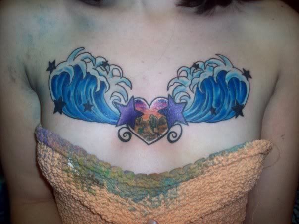
Now, I know chest tattoos can be tricky to get right. Mine is not all that great (I might be getting it redone soon). It can be the best looking spot or the most awkward looking spot, and, unfortunately, this one just looks awkward. The great reader who emailed me this photo said that it looks like a Lisa Frank tattoo, and she is so right! I am not sure what is going on inside the heart- is that a landscape of some kind? The waves look awkward and the stars over them are superfluous, not to mention the weird swirls on the bottom.
One good thing is that the execution looks decent enough, although how gross is it that they didn't use a paper towel to cover her up? All the ink and goo has seeped into her shirt!
This next one is pretty small, but worth looking at all the same:

A heart with crossbones is a cute idea, and the little line stars are traditional and can be good filler on some tattoos, but jeeeeez louise what is going on with the black shading? And the linework looks so sharp it makes me wince just to look at it!
This one was submitted by the same reader, and may be from the same artist:
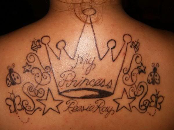
Again, the linework is beyond awful. The composition is beyond awful. And is the princesses name Reesie?
I must admit I do kind of like the awkward little bumblebees though, as terrible as they are.
If you have a terrible tattoo to share with me, don't hesitate to email!
No comments:
Post a Comment