Anyway, here are some crappy cellphone pictures that I took this morning, and then some old pictures of the half sleeve. I'll try and get some better ones soon.
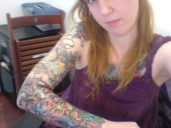
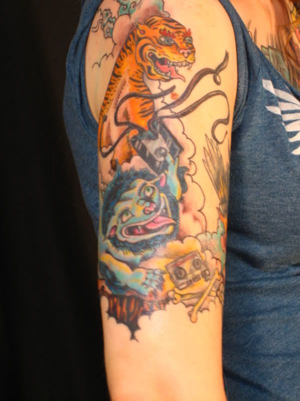
Here's one with my whole sleeve so you can get the general idea of how awesome the whole thing is together.
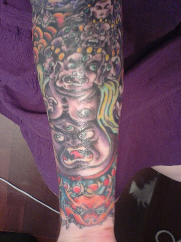
Close up of the protector demon
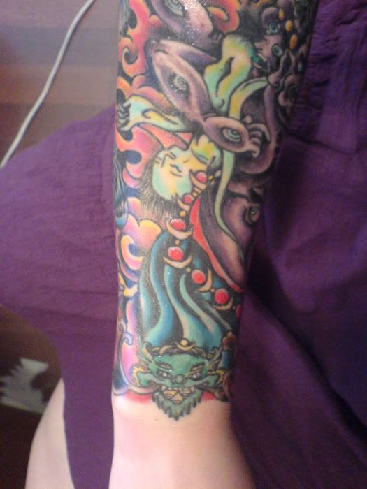
This is my favorite part of the tattoo-- where all the sections come together. The blue and yellow guy is flayed human skin turned into a cape.
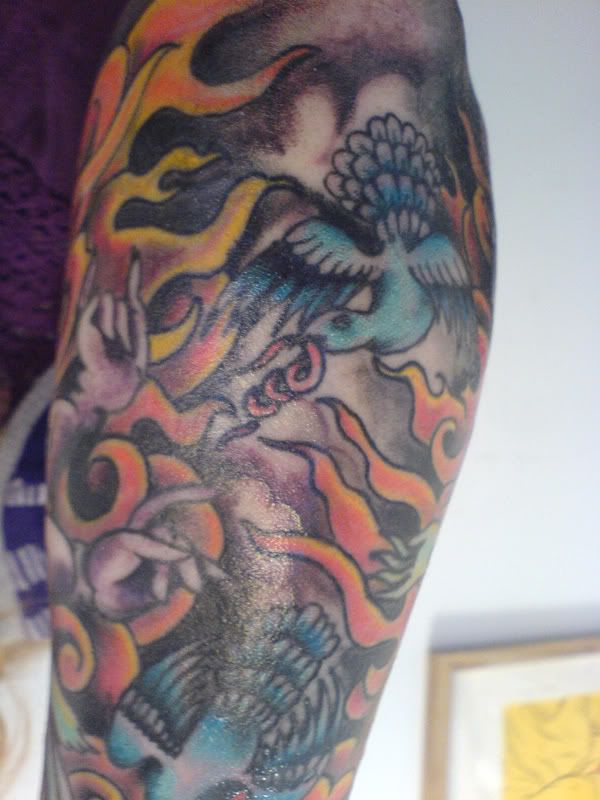
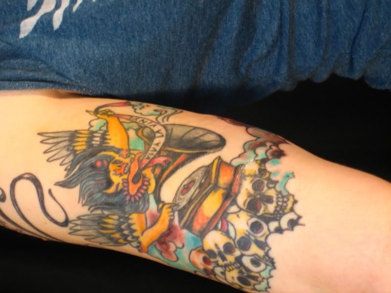
Shiny closeup of the birds. The one you can see has intestines in it's mouth. The other one has a heart in it's mouth.
and old pictures of the top half of the sleeve (some with the dragon, some unfinished & without):
one
two
three
four
I really need to take pictures of the whole arm piece by piece so the whole thing is documented correctly, but I need a friend with an awesome camera to help out with that, so it might be a while!
Anyway, sorry for the break from awful tattoos, I will get right on to posting some terrible ones for you shortly.
xo
Alice
12 comments:
Fits great into your blog. It truly looks awful. I don't know why everyone is after those colorful, pictural tattoos. It just looks cheap in my opinion. Also, you will get bored of those pictures pretty soon, it's the nature of pictures, when looking at them too often. I think it's way better to choose more abstract shapes and a single dark color, which contrasts nice with the skintone. Yeah, there's nothing better than CLASSIC tribal designs.
anonymous: Ew? Tribal designs are ridiculous in contemporary society, so I'm assuming you're one of those with symbols with histories you don't even understand all around your biceps.
Also, plain black tends to look like a never-finished sketch unless it's extremely well-executed. I didn't realize color was out of fashion for anyone other than faux-Goth tweens.
Tribals are ridiculous? How can something be ridiculous, if it has 1000s of years tradition? Those symbols should always have a personal meaning, so it's always best to draw, arange and come up with them on your own. Obviously, going into a tattoo shop and choosing a stupid tribal from the books is ridiculous. But that's not what I'm talking about.
Plain black tends to look like a never finished sketh? Obviously you have no idea about principles in art. Something looks sketchy if it's done with loose, fast, gestural lines, and if it's filled by hatching. None of this aplies to classic tribal designs. Tribal desings are more about abstract, graphic design, about telling something with simple means.
Your last sentence is the best and shows really what kind of person you are. What the hell, does be in or out of fashion have to do with tattoos? It seems you are the kind of person who gets a (colorful) tattoo, because it's trendy? That's the worst thing one can do and shows how little you know about tattoos. I'm not quite sure what faux-Goth tweens are supposed to be, but it truely is a good hint for your stereotyped thinking.
HA! you think that kurt halsey tattoos are creepy and "twee" yet you have a bird with its intestines flowing out of its mouth. yeah, now that's CLASS.
personally, i would rather have a five year old tattoo a kurt halsey drawing on me than have intestines on my arm for the rest of my life.
I know that this is a comment coming in a bit late but all I have to say is this: a tattoo doesn't need to be colored to high hell to be held in high regard. Quite personally, I find myself in favor of simple, black designs and I'm no tween, nor am I at all faux-Goth. And I disagree that plain black tends to look never-finished. If one were unfortunate enough to place their trust in questionable hands, then maybe that's the case. But any artist (tattoo or otherwise) will be able to produce something solid and perhaps even a bit sophisticated using only black. I often feel that many artists use color as a crutch. The ability to produce something pleasant using so little is, in my honest opinion, the sign of a true artist. I'm not saying that it's not good to use color. Color is good, yes. But it's sometimes not necessary. Too much emphasis is put on color and shading, etc. It's the magician's distraction hand, if you ask me. Which you didn't. So I'll shaddup.
this is actually just as bad as the ones you normally post.
Awesome tattoo!
Ugh, some people fail at life.
A tattoo isn't bad because it's all black, black with gradients, or colorful. That comes down to preference and how you personally define yourself.
What makes a bad tattoo is the shakyness of the linework, the lack of details in the centerpiece (or just overall), no thought into the design, etc.
To me, that tattoo is pretty decent. The lines are pretty solid and even though it doesn't hold much detail, it's pretty difficult to get a good blend of amazing detail along with color.
Also, someone mentioned that tribal tattoos are about abstract and graphic design. You're wrong. Period. Maybe you should google yourself the "Elements and Principles of Design" and educate yourself on what "Design" really is. To me, this tattoo is catchy and appealing to the eye. I want to check it out and give it some attention. Sure, it lacks some structure to it but it will catch my eye over %99 of ANY tribal tattoo. It does it's job.
Also, off the top of my head I have no recollection of any logo, brand name, etc to be just black. Dell is blue, McDonalds is red and yellow, Google is all over the place, etc.
And just to continue on my rant, take a look around a ghetto or a trainyard sometime and take a moment to admire the graffiti in the area. Some of it can be truly magnificent and the best ones are always in color.
Next post guy! Just because something has 1000s of years of history doesn't make it a good thing. I mean, we never took showers for 1000s of years... do you have a tribal design? Do you regularly shower? Who knows!
Whatever tribal design you may happen to "draw up" it will look like you randomly picked it off of the wall at the shop to get put on your body. It looks like you got a tattoo because your friends dared you to. Ask a guy what his tribal means and he'll be like (whatever clever meaning it has) and I'll be like "Sure bud, that's cool"... Not! You look like an idiot!
Seriously though, Elements and Principles of Design. Look it up. That's day ones notes in any design course.
Christine?
Fits great into your blog. It truly looks awful.
couldn't have said it any better!
I'm sorry to say alice, but it really isn't that great... not that the art is bad, but its not really that cool. But hey we all have different tasts etc. i like the colors though...
I actually really like it, and I normally hate sleeves. But if it's the old biker look you're going for, you definitely nailed it. It's well done, the colours are great, and it has a tiger, demon, and birds with intestines. Who could ask for more!
Personally, I do like black and gray tattoos better, but only if they are really well done. All of mine but two are done in shades of black.
But this sleeve looks great coloured!
Post a Comment